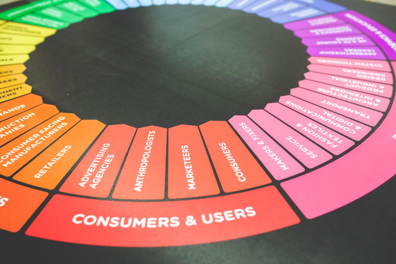
Color psychology marketing frequently exaggerates unverified statistics and promotes universal emotion claims that lack scientific support, when credible research actually shows a color's psychological impact depends on cultural context, brand fit, contrast, and consistent exposure rather than any single hue's inherent meaning.
What if that trusted brand blue or urgent-feeling red is doing less than you think? Color psychology marketing has sold us confident rules for decades, but the research behind them is shakier than most blogs let on. Here's what actually holds up.
What is color psychology, really?
Color psychology is the study of how hues influence human perception, emotion, and behavior. It draws from cognitive science, vision research, and environmental psychology, making it a legitimate field with real scientific roots. According to a critical review of color psychology, the research spans a wide spectrum of rigor, from controlled laboratory studies to loosely interpreted observations.
The problem is what happens when that research leaves the lab. Marketing blogs, branding guides, and design courses often strip findings from their original context, overgeneralize them, or repeat claims that were never supported by evidence in the first place. You’ve probably seen the confident declarations: red triggers urgency, blue builds trust, green means health. Some of those ideas have a grain of truth. Many don’t hold up under scrutiny.
Rather than handing you a color-to-emotion cheat sheet, this piece examines what the science actually says, where the evidence is solid, where it’s murky, and where popular marketing wisdom has simply invented a narrative. Color psychology is a genuinely useful lens for understanding consumer behavior, but only when you know which parts of it to trust.
The color-emotion associations you’ve heard (and where they came from)
You’ve seen the lists everywhere. Red means urgency or passion. Blue signals trust and calm. Green evokes health and nature. Yellow radiates optimism, purple suggests luxury, orange communicates energy and fun, and black conveys sophistication. These color-emotion associations feel almost like common sense at this point, repeated across marketing blogs, design courses, and brand strategy decks for decades.
But where did these lists actually come from? Tracing them back is surprisingly difficult. Most don’t originate from peer-reviewed psychology research. Instead, they descend from a small number of pop-psychology books, design manuals, and widely shared infographics that cited each other in a loop. Even research that gets treated as authoritative, like frequently cited color-emotion association research from undergraduate studies with narrow sample groups, became foundational simply because it was early and accessible, not because it was rigorous or broadly representative.
So why do these associations feel so convincing? A few cognitive patterns are at work. Confirmation bias leads us to notice the times a color fits the expected emotion and ignore the times it doesn’t. Learned cultural associations also play a role: if you grew up seeing red on clearance sale signs, red starts to feel urgent. The availability heuristic, the mental shortcut of trusting whatever comes to mind most easily, does the rest. The lists get repeated, they become familiar, and familiarity gets mistaken for truth.
This matters beyond marketing. Color perception is tied to mood in ways that connect to real psychological experiences, including mood disorders that affect how people process and respond to their environment.
Checking the receipts: where these statistics actually come from
You’ve seen the numbers everywhere: color drives 85% of purchase decisions, snap judgments are 90% color-based, and color boosts brand recognition by 80%. These color psychology statistics circulate through marketing blogs, pitch decks, and agency websites as settled fact. The problem is that almost nobody has gone back to check the original sources. When you do, the story gets complicated fast.
The ’62–90%’ and ‘90% snap judgment’ claims
Both of these figures trace back to a single paper: Satyendra Singh’s 2006 article published in Management Decision, titled “Impact of color on marketing.” Singh reviewed existing color research and cited a range, noting that people make a judgment about a product within 90 seconds and that between 62% and 90% of that assessment can be based on color alone. The original figure was a range, drawn from earlier environmental psychology studies conducted in retail settings with specific product categories. By the time this finding traveled through hundreds of blog posts, the range collapsed into a single, confident number: “90% of snap judgments are based on color alone.” The nuance that this applied to certain contexts, not all purchasing decisions, quietly disappeared.
The ‘85% of purchase decisions’ claim
This statistic is even harder to pin down. It is frequently cited without any author or journal attached, and when a source does appear, it often loops back to the same Singh (2006) paper or to undated industry white papers with no peer review. The 85% figure appears to have originated in trade publications and was then laundered through repetition until it acquired the credibility of research. No published, peer-reviewed study with a documented sample size cleanly supports this specific number. That doesn’t mean color doesn’t influence purchasing, because there is genuine evidence that it does. It means this particular figure is not a finding you can responsibly stake a strategy on.
The ‘80% brand recognition’ claim
This one is commonly attributed to a study from the University of Loyola, Maryland. The claim is that color increases brand recognition by up to 80%. In practice, the original study is nearly impossible to locate in any academic database, and details like sample size, methodology, and publication year are absent from virtually every source that cites it. A statistic without a verifiable methodology is closer to an estimate than a finding.
Why zombie statistics survive
These numbers persist for a simple reason: they are useful, they are confident-sounding, and checking the footnotes takes real effort. A marketer building a case for a rebrand doesn’t want a range with caveats. They want a number. So the caveats get stripped, the ranges become absolutes, and the original context fades. The result is an entire corner of marketing advice built on a foundation that looks solid until you press on it.
The myth-by-myth fact-check
Color psychology myths spread fast in marketing because they feel intuitive. A claim gets repeated in a blog post, then a conference deck, then a brand guidelines document, until it hardens into received wisdom. Here is what the research actually shows.
Red creates urgency: supported, overstated, or debunked?
Claim: Red triggers urgency and drives impulse purchases.
Findings: Red does produce measurable physiological arousal, including elevated heart rate and heightened alertness. That arousal response is real and documented. The leap from “red is arousing” to “red drives purchases” is where the evidence thins out. Arousal is not the same as buying intent, and the same anxiety and arousal response that might prompt a quick click can just as easily produce avoidance in high-stakes purchase decisions.
Verdict: Overstated. The arousal effect is supported. The direct conversion claim is a marketing extrapolation, not a research finding.
Claim: Yellow triggers anxiety.
Findings: Some studies link high-saturation yellow to visual strain and agitation. Others position yellow as optimistic and energizing. The contradiction exists because both can be true depending on shade, context, and surrounding colors.
Verdict: Overstated in both directions. Yellow’s effect is heavily conditional, not a fixed emotional trigger.
Claim: Green signals health and eco-friendliness.
Findings: Green’s association with nature and wellness is real, but it is a learned cultural association, not an innate response. Decades of environmental branding have reinforced the link, which means it works in contexts where that shorthand is expected and falls flat where it is not.
Verdict: Supported but context-dependent. The association is reliable within established categories, not universally transferable.
Claim: Color alone can increase conversions by specific percentages.
Findings: Statistics like “changing a button to red increased conversions by 21%” almost always come from single-variable A/B tests on specific sites, in specific industries, with specific audiences. No peer-reviewed body of evidence supports a generalizable conversion lift from any single color change.
Verdict: Misquoted. Isolated test results are real. Treating them as universal rules is not.
Blue builds trust and purple means luxury: the correlation trap
Claim: Blue builds trust.
Findings: Blue dominates banking, healthcare, and technology branding, and those are high-trust industries. That is a correlation. Empirical research mapping hues to brand personality dimensions found that blue reliably maps to competence, not trust specifically. Saturation and brightness also shape perceived personality as much as hue does, a nuance the “blue equals trust” shorthand erases entirely. Context-dependent retail color research reinforces this: blue’s advantages are specific to certain retail environments and lighting conditions, not a universal consumer response.
Verdict: Overstated. Blue correlates with competence perception in some contexts. Treating it as a universal trust signal mistakes industry convention for psychological law.
Claim: Purple signals luxury.
Findings: Purple’s luxury association traces to ancient dye scarcity: Tyrian purple was extraordinarily expensive to produce, making it a literal marker of wealth and royalty. That historical coding persists in some contexts. Modern consumer research shows the effect is inconsistent across demographics, product categories, and cultures.
Verdict: Overstated. The historical association is real. Its reliability as a modern luxury signal is not.
The color preference vs. color persuasion problem
This is the most overlooked issue in the entire color psychology conversation. Liking a color and being persuaded by it are two completely different things, and most marketing advice conflates them.
Research by Labrecque and Milne (2012) makes the distinction explicit: consumer color preferences tell you what people find aesthetically pleasing, not what will change their behavior. A person might genuinely love orange and still not associate it with the brand values you are trying to communicate. Preference is about taste. Persuasion is about meaning, and meaning is built through context, repetition, and cultural conditioning, not hue selection alone.
This gap explains why so many color psychology myths survive testing in surveys but collapse in real purchase behavior. When you ask someone what a color makes them feel, you get one answer. When you measure what they actually buy, you often get another.
What color research actually does support
After pulling back the curtain on color mythology, it’s fair to ask: does color psychology research tell us anything useful at all? The answer is yes, but the real findings are far more specific and conditional than any emotion chart suggests. The science points to mechanisms, not magic, and understanding those mechanisms is what separates effective design from superstition.
Arousal, fit, and the Von Restorff effect
One of the most replicated findings in color psychology research is that red increases physiological arousal. Elliot and Maier’s 2014 work confirmed this effect, but arousal is not the same as purchase intent. A racing heart can mean excitement, anxiety, or urgency depending entirely on the situation.
What does hold up is the concept of brand-color fit. Research by Bottomley and Doyle (2006) found that the perceived appropriateness of a color for a brand category matters far more than any emotion the color supposedly triggers universally. A soft blue feels right for a bank and wrong for a fast food chain, not because blue means trust in some hard-wired sense, but because it fits the cultural expectations of that category. Fit beats feeling every time.
There is also the Von Restorff isolation effect, one of the most practical tools in the real toolkit. A color that stands out from its surrounding colors captures attention regardless of which specific color it is. Distinctiveness drives noticing, not meaning. Place a muted green button on a page full of muted greens and it disappears. Make it the only saturated element on the page and it stands out, whether it’s orange, teal, or red.
Why context overrides any color chart
Simultaneous contrast adds another layer of complexity. Colors shift in perception based on the colors placed next to them, which means no color carries a fixed psychological effect in isolation. The same shade of gray looks darker against white and lighter against black. This single principle dismantles the idea that you can assign a color a meaning and expect it to land the same way across every design context.
An integrated framework for understanding color’s role in marketing supports this constructive reframe: color does influence perception and behavior, but through embodied meaning, cultural reference, and contextual fit rather than through universal emotional triggers. This mirrors what cognitive behavioral frameworks have long established about human perception more broadly: context and cognition shape how we respond to any stimulus, not the stimulus alone.
The real finding, then, is this: context, contrast, and cultural fit determine color effectiveness. If you’re curious how color and environment actually affect your own mood day to day, ReachLink’s free mood tracker lets you log and spot patterns at your own pace, available on iOS or Android.
Cultural and contextual variation in color perception
Color psychology charts often present color meanings as universal truths, but a quick look across cultures reveals a far messier picture. The same color can carry completely opposite associations depending on where you are in the world, who you’re marketing to, and what generation you’re speaking with. Just as culturally influenced social perception shapes how people interpret social cues and emotional signals, cultural context shapes how people read color at a fundamental level.
When white means mourning and red means luck
In most Western markets, white signals cleanliness, purity, and simplicity. It’s the go-to color for wedding dresses, hospital branding, and minimalist product packaging. In several East Asian cultures, including parts of China, Japan, and Korea, white is traditionally associated with mourning and funerals. Brands that have launched white-heavy packaging or campaigns in these markets without localizing their approach have found themselves sending an unintended message to consumers.
Red tells a similarly complicated story. Western marketing often uses red to signal urgency, danger, or a clearance sale. In Chinese culture, red carries associations of luck, prosperity, and celebration. It dominates Lunar New Year imagery and is considered an auspicious color for major life events. A red price tag in a US grocery store says “buy fast, this is almost gone.” The same red in a Chinese retail context can feel festive and premium. Same color, completely different emotional register.
Some global brands have navigated this well. McDonald’s, for example, has adjusted its color emphasis and visual identity across different regional markets rather than applying a single global template. Others have stumbled by assuming their home-market color logic would translate cleanly.
How generation and subculture shift the meaning further
Cultural variation in color perception doesn’t stop at national borders. Within a single country, color associations shift across age groups, subcultures, and communities. Millennial consumers in the US responded strongly to the muted, earthy tones that defined the “millennial aesthetic” in the 2010s. Gen Z has since gravitated toward bolder, more saturated palettes and Y2K-era color combinations. What reads as sophisticated to one demographic can feel dated or even off-putting to another.
This is the core limitation of any universal color psychology guide: it reflects the population it was studied in, at a specific point in time. Cultural color perception is not static. It evolves, it fragments across subgroups, and it responds to broader social and historical forces. Treating color meaning as fixed is a shortcut that the evidence simply doesn’t support.
Color and brand recognition: what the evidence says
Brand color recognition is real, measurable, and genuinely valuable. Colors don’t earn recognition by triggering the right emotions. They earn it through repeated exposure, consistency, and standing out in a specific competitive landscape.
Consider Tiffany blue, UPS brown, or T-Mobile magenta. None of these colors carry an obvious emotional logic. Brown is not an exciting or aspirational color by most accounts, yet UPS has made it iconic. The reason is simple: no other major shipping company uses it. Research on colour and meaning in corporate logos supports this view, finding that color recognition in branding is driven by consistency and perceived contextual fit, not by a color’s supposed intrinsic emotional properties.
This is the distinctiveness principle in practice. A brand that owns a color in its category benefits from that ownership, regardless of what the color is theoretically supposed to communicate. The color becomes a recognition cue, not an emotional trigger.
Consistency over time matters far more than the initial color selection. A well-chosen color used sporadically will underperform a mediocre color used relentlessly across every touchpoint, year after year. Recognition is built through repetition.
The practical takeaway is straightforward: survey your competitive landscape, identify what colors your competitors are already using, and choose something that differentiates you. Then commit to it fully. The strategic value of your brand color comes from how consistently and distinctively you use it, not from any psychological property the color itself possesses.
An evidence-based color decision framework
Most color marketing strategy advice skips straight to emotion charts and symbolic meanings. A more grounded approach treats color as a branding variable to be tested and refined, not decoded. This four-step framework reflects what the research actually supports.
Step 1: Audit your competitive color landscape
Before choosing any color, map what your competitors are already using. Every category develops visual norms over time, and standing out starts with knowing which colors are already claimed. The goal is to find the open space, not to pick the color that supposedly signals the right emotion.
Step 2: Choose for distinctiveness
The Von Restorff effect, the tendency to remember things that stand out from their surroundings, is one of the most reliable findings in this space. A color that differentiates your brand from competitors will serve you better than one chosen because a chart says it conveys trust or energy.
Step 3: Optimize for your actual usage contexts
A color that looks bold on a website can disappear on packaging or wash out on signage. Evaluate contrast and salience across every real environment where your brand will appear: screens, print, outdoor displays. Hue meaning matters far less than visibility.
Step 4: Validate with your specific audience
Generic guidelines cannot tell you how your particular customers will respond. Run properly controlled A/B tests with your actual audience, measure real outcomes, and let the data guide your decisions. Test, learn, and refine as your brand and market evolve.
You Were Right to Question What You Were Told
There is something quietly disorienting about discovering that advice you have been given with great confidence does not hold up the way it was presented. Color psychology marketing is a real and useful field, but the version of it that circulates most widely has been simplified to the point of distortion. What you have read here is not a reason to distrust your instincts entirely; it is an invitation to trust them more carefully, with better questions and a clearer sense of what the evidence can and cannot tell you.
Your brand decisions deserve more than a chart someone found on Pinterest. If you want to think through how perception, context, and meaning shape the way people respond to your work, or simply how your own environment affects your mood and wellbeing, the therapists and coaches at ReachLink are available at no cost to get started, with no commitment required, so you can explore what support looks like at a pace that feels right for you.
FAQ
-
Is color psychology actually backed by science, or is most of it just made up?
Color psychology is a legitimate field rooted in cognitive science, vision research, and environmental psychology - but the version most people encounter in marketing has been heavily distorted. Real findings exist, such as red producing measurable physiological arousal and color distinctiveness improving brand recognition, but these effects are far more conditional and context-dependent than any emotion chart suggests. Many confident claims circulating in branding guides and design courses either originated from pop-psychology books, were stripped of their original context, or were never supported by peer-reviewed evidence in the first place. The most honest takeaway is that color influences perception in real but limited ways, and knowing which claims to trust matters more than memorizing a color-emotion list.
-
Can therapy actually help if I feel like my environment or surroundings are affecting my mood?
Yes, therapy can be genuinely useful when your environment, including the spaces you live or work in, seems to affect how you feel day to day. Cognitive behavioral therapy (CBT) helps people identify how their surroundings and the meanings they assign to them shape their emotional responses, which is particularly relevant when someone notices patterns like heightened anxiety, low mood, or irritability tied to specific contexts. A licensed therapist can help you distinguish between environmental triggers and deeper emotional patterns, and develop practical strategies for managing how external stimuli affect your internal state. If you have noticed that your mood shifts in consistent ways based on where you are or what you are exposed to, that is worth exploring with a therapist.
-
Why do color psychology statistics like "85% of purchase decisions are based on color" keep getting repeated if they're not actually proven?
These statistics survive because they are useful, confident-sounding, and almost nobody takes the time to check the original sources. Most of the famous color psychology numbers trace back to a small number of papers or industry white papers that lacked rigorous methodology, and then got repeated across blogs and pitch decks until the caveats disappeared entirely. The process works like a game of telephone where each retelling drops another layer of nuance, and the result is a figure that sounds like settled science but is actually closer to an educated estimate. Checking primary sources and looking for peer-reviewed studies with documented sample sizes is the best defense against this kind of statistical drift.
-
I think stress or anxiety might be affecting how I see and respond to things around me - where do I even start getting help?
Starting with therapy is simpler than most people expect, and finding the right therapist does not have to feel overwhelming. ReachLink connects people with licensed therapists through human care coordinators - not an algorithm - who take time to understand your situation and match you with someone genuinely suited to your needs. You can begin with a free assessment to get a sense of what support might look like for you, with no commitment required to continue. Taking that first step is often the hardest part, and having a real person guide the matching process means you are far less likely to end up with a poor fit right from the start.
-
Do cultural differences really change how people respond to colors, or is that kind of overstated too?
Cultural context genuinely does change how people interpret and respond to colors, and this is one of the more well-supported findings in color psychology research. White signals purity and simplicity in most Western markets, but is associated with mourning in parts of China, Japan, and Korea. Red communicates urgency or danger in many Western retail contexts, but carries strong associations of luck and celebration in Chinese culture. These differences are not minor variations - they can completely reverse the emotional signal a color sends, which is why treating any color psychology guide as universally applicable is a significant strategic risk.